 Previously, I completed a series of steps to interpolate time series data, for example,
monthly sales or sales performance, output the graph as an image, and create a
movie from them. I have integrated these processes in a more user-friendly way
and created a macro file that can create a moving graph (motion graph, motion
chart) in as little as two minutes.
Previously, I completed a series of steps to interpolate time series data, for example,
monthly sales or sales performance, output the graph as an image, and create a
movie from them. I have integrated these processes in a more user-friendly way
and created a macro file that can create a moving graph (motion graph, motion
chart) in as little as two minutes.
Getting the integrated version
It is available at the following link
https://diy360.booth.pm/items/3315820
Note! There is also an enhanced version.

https://magtanate.blogspot.com/2021/09/Lang-English-moving-bubble-chart.html
DIY360
Examples of motion charts created with the integrated version
I have tried a few of them and will introduce them here. Other graphs that can be done in Excel may also be supported.
Example 1: Bar chart (also in 3D)

In addition to regular bar graphs, it is also possible to create 3D bar graphs. This is a 3D bar chart created by selecting a preset design in the "graph design". Of course, you can change the 3D angle freely, and you can also change the color of each bar, just like the usual static bar chart.
Example 2: Horizontal bar chart (also in 3D)

Since the vertical bar chart moves, of course the horizontal bar chart also moves. In this example, a 3D horizontal bar chart is created first, then the shape of those bars is changed to cylinders, and the colors are changed individually.
Example 3: Line chart

The format is basically the same as the vertical bar chart, so it works. This is another line graph that I created and then selected one of the graph design presets. It's interesting to note that the numbers are also displayed at the bottom.
If you want to have a moving line graph where the line extends smoothly to the right, you can create it by using animation in Powerpoint without using this macro.
Example 4: Pie chart (also in 3D)

After creating a pie chart, you can also create something like this by choosing from the graph design presets or adding data labels to it.
If you increase the value of "pie explosion" to separate in the series options, you will see the following

Also, when you create a pie chart, you can select the pie of pie chart with an auxiliary circle.

It's kind of fun.
Example 4: Radar Chart

This seems to be basically the same as the line chart, so it worked. I wonder if it would be easier to understand if I changed the color of the dots or something.
Example 5: Bubble chart (coordinates are fixed, bubble size varies)

This differs from the graph format described above in that it requires three elements: X coordinate, Y coordinate, and bubble size. For this reason, I added a few options. In short, I have added two lines to display the X and Y coordinates, and only refer to the bubble size in succession.
I added this feature because I thought it would be convenient to use it with a map by entering the latitude and longitude in the coordinates. (I'll show you an example of combining it with a map below!)
By the way, the newer version of Excel has a function to match chart with a map (filled map), but this macro does not support it, unfortunately.
Sheets of the integrated version
The integrated version consists of the following three sheets,
- Raw data: As the name suggests, this is a sheet for inputting data before interpolation.
- Interpolation result: A sheet where the interpolation result is displayed, and where you can check the result in a graph, create or adjust the graph you want to make into a moving graph, or output it as an image.
- Output as mp4: Sheet for converting the output image into a movie. You can set the length and smoothness.
In order to be able to handle data with a large number of items, I decided to divide the functions into separate sheets, rather than having one sheet complete the whole process.
First, I would like to explain the "Raw data" sheet.
Sheet "Raw data" Input Instructions
The raw data sheet looks like this. This is the state where the sample data is stored.

Set the desired number of interpolated data in cell B4.
In cell B4, enter the desired number of data for the desired interpolation per item. The recommended value is automatically displayed in "Cell C4" to the right. For example, if the raw data itself has 10 rows as in the sample, the recommended value would be {(10-1) x any integer} + 1.
Note that not using the recommended value does not necessarily mean that the calculation cannot be done, but it does increase the possibility of a discrepancy in the calculation.
And please also note that cell B4 should be less than 9999. If you rewrite the macro, it can handle more than 9999, but just to be safe, I've set 9999 as the upper limit so that it will work even on a PC with low specs.
Date and time, or just a sequential number, downward from cell F2
As the name suggests, you can enter a date, time, or a sequential number such as 1, 2, or 3 in this column. It can be an integer, a decimal point, or anything that starts with a minus sign, and although there will be some discrepancies in principle, it is likely to be possible in many cases where the spacing is not even.
Then, if you put in a date/time, this macro will work if Excel can recognize it as a serial value (a numeric date/time).
For example, if you enter 2021/05/01 10:00 in cell F2, Excel will assume that this is the date and time, so the display will show YYYY/MM/DD hh:mm, but behind the scenes, it will be processed as a serial value of 44317.4166666667.
If the data is for every 18 hours, for example, enter =F2+"18:00" in cell F3, and you will see the data at 4:00 on May 2, 2021, 18 hours later. Here is a video of it.
Raw data to column G and beyond (supports multi-item data)
Enter the raw data in the columns after G. The first line is for the item name, and the second and subsequent lines are for the raw data, such as time series data. I have not set any lower or upper limits for the values. Since it is defined as Double type, it should be almost safe up to 1.8 x 10 (308 squared).
As a reminder, the raw data is set to a maximum of 2000 lines, so please be careful not to exceed that. You can also rewrite the macro to increase the number of lines, but I put a limit just in case to make sure it works fine on as many computers as possible.
I have also made the macro to support multi-item data. There is no restriction on the maximum number of items, and the Do~While statements let the processing continue until the column is empty. However, when the linear interpolation process is started, the interpolation result sheet is cleared once, and the clear range setting is up to ZZ columns, so it might be better to keep it at that level. Of course, depending on your PC specs, it may be safer to use less.
Then, please note that if there is a missing value (blank cell), it will be judged as zero. I hope you can put in any value (like the average of before and after) by yourself.
Execute the linear interpolation macro.
The execution method is simple. After you have finished entering the raw data according to the above, press the "Execute Linear Interpolation" button.
Then a message box will appear saying, "The data in the interpolation result sheet will be deleted once, are you sure? "
Select "Yes" if you are OK, or "No" if you want to stop for a while.
If you select "Yes" above, the data on the interpolation result sheet will be cleared once, and then the interpolation calculation process will be executed.
The progress status is shown in the status bar at the bottom of the screen, so you can check if it is frozen during processing.
The general flow is like this,
- Read the F column of the raw data
- Calculate the interpolation of column F according to the desired number of interpolated data, and output to the interpolation result sheet.
- Read column G of the raw data.
- Calculate the interpolation value of column G corresponding to the interpolation value of column F, and output to the interpolation result sheet.
- Read column H of raw data.
- Calculate the interpolation value of column H corresponding to the interpolation value of column F, and output to the interpolation result sheet.
- ... (Repeat for columns I, J, and K)
- Stop the process when the column becomes blank (Exit Do~While loop)
- Pass the data to compare the raw data and the calculation (interpolation) result to the graph in the interpolation result sheet.
- During the calculation, if there is a case where the discrepancy between the raw data and the interpolated value exceeds a certain level, a variable will be increased, and depending on the result, a warning message will be displayed.
The basic idea of the script is the same as explained in the previous post, where the process after column G is repeated in a Do~While loop in order to be able to handle multiple items.
I don't need to explain the message box display, sheet clearing process, and status bar display as I am a novice and you can easily find them by searching.
Explanation of the sheet "Interpolation Results"
Contents of the sheet
The interpolation result sheet looks like this,

Cell B1 displays the automatically counted number of data rows after interpolation (only the numerical data part, excluding the item names). Note that the number of data in column G is counted, so please make sure that there are no missing values in column G.
In cell D1, the number of items (excluding Time or No., and the number of columns to the right of column G) will be automatically counted. Note that the cells are counted from row 5 (G5) of column G to the right. Please be careful of missing values here as well.
Introduction of the "Check interpolation result in graph" button
This sheet contains a graph (titled "Result Confirmation (Partial)") to confirm that there is no discrepancy between the raw data and the interpolated values.
This graph is drawn based on the data in column F and certain columns after column G.
If you are processing multiple data items such as columns H and I and want to check the results, you can press this button consecutively to display the results one after another in the confirmation graph.
Cell B3 shows the column numbers after column G that will be displayed when this button is pressed, and it will automatically increase each time the button is pressed. If there are no more items, the number will return to 1 (= column G). Anyway, this is a function to confirm that there is no discrepancy in the calculation results by simply hitting this button repeatedly.
Introduction of the " Set graph size to specified value and output test image" button
Cells D2 and B2 allow you to set the vertical and horizontal sizes (in pixels) for outputting the graph as an image, respectively.
After setting the desired pixels in these cells, create and select (activate) the prototype of the graph you want to make into a moving graph (as described in the next section), and press this button. This will change the graph size to the specified one and output the PNG image of the graph to a folder (C:\MovingGraph_workingfolder).
However, it is important to note that sometimes, even if you set the width size to 300, the output image will somehow be 301. In this case, try setting it to 299. It seems that it is difficult to adjust the size exactly as you want, so look at the size of the image output with this test output button and adjust the values in cells B2 and D2.
In fact, there is no need for exact adjustments. I mentioned earlier that FFmpeg's specifications make it impossible to convert images with odd pixel sizes, but I have succeeded in avoiding this problem by putting some ideas into the script (see below).
Introduction of the "Continuous Processing of Bar, Pie, Line, and Rader Charts" button
Before clicking on this button, you need to create a prototype of the graph you want to make into a moving graph. By prototype, I mean a bar graph or pie chart created using only the first two rows of data.
As an example, using the sample data provided, select cells G1 to L2 and go to Insert -> Bar Chart.

Then, as mentioned in the previous article, fix the range of the vertical axis (otherwise the graph will look like the vertical axis is always changing).

If you want to display a sequential number or time in the graph title, select "With Time or No." from the list menu in cell E1 ("With" by default),
Right-click on the graph, select Data → Legend Item (Series) -> Edit,

Select cell F2.

Finally, after moving the title a little bit, select "Left-justified" in the placement ribbon of the Home tab. (Otherwise, it will bounce around to fit the decimal point.) The reason for "move the title a little bit" is that if you don't do this, the left-justification doesn't work in my version of Excel. I guess it's a bug in Excel.

You can also add data labels as needed.

However, if the labels shake when you convert them to video, you may need to adjust the data labels to the left, or unify the number of digits displayed as much as possible (for example, do not display the decimal point). This is a case-by-case basis, so you will have to adjust it as you try it out.

After completing the above, make sure that the graph is selected (activated) and click the "Process Bar and Pie Chart Continuously" button to start the process. At the start of the process, a C:\MovingGraph_workingfolder will be created (if not already there) and the sequentially output images will be stored there with the sequential number Transition_00000.png. Please note that the previous data will be overwritten if it is still there.
!!Do not click on any other cell in Excel during the process. If the graph becomes inactive (not selected), an error will occur. If an error occurs, select Quit, click on the graph again to select (activate) it, and press the button again.
Introduction of the "Add Cell for Bubble Chart Coordinates" and "Release Cell for Coordinates" buttons
This is for when you want to create a bubble chart where the size of each bubble changes. The coordinates are fixed, and this button is used to add two lines for entering the coordinates.
Pressing this button will insert a two-row cell after column F, where you can enter the X and Y coordinates. If you have decided to quit, click the Release Coordinate Cell button to delete the cell. Note that if the cell is deleted, the entered coordinate values will be lost.
By the way, as I wrote before, you can change the size of the bubble over time on any map by entering the latitude and longitude, as shown in the figure below. This is a hand-drawn map, sorry for the poor quality.

Using the second through fourth lines, create a bubble chart using Insert → Bubble Chart. The rest is the same as for the bar chart.
If you want to include a map, select Fill (Figure or Texture) in the graph area options, and insert a suitable map. You can also adjust the size of the map in the Offset section below.

Note: I also made a version where the bubble moves!
https://magtanate.blogspot.com/2021/09/Lang-English-moving-bubble-chart.html
DIY360
Instructions for the sheet "Output as mp4"
Contents of the sheet
This sheet has three cells for input and three buttons.

The number of rows of interpolated data is automatically reflected in cell D3 as necessary information for the following automatic settings.
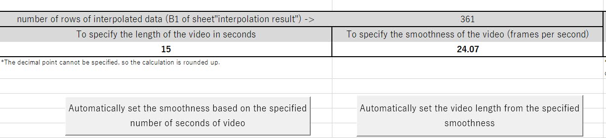
Button "Automatically set the smoothness based on the specified number of seconds of video".
For example, if you want to make a 15-second video with 361 data points, the number of frames per second (smoothness) is 361 ÷ 15, which is 24.07. So, if you enter 15 as the number of seconds and click this button, the smoothness will be automatically reflected as 24.07.
button "Automatically set the video length from the specified smoothness"
On the other hand, if you have 361 data and want to set the smoothness to 30, the value will be 361 / 30 = 12.03. If you use 12.03 here, only the last frame will not be reflected in the movie.
Therefore, we have made it so that the number that has been rounded up is automatically entered into the cell. When I created the video with this setting, the properties of the video file showed 12 seconds, but all the frames were used. I wonder if the properties show the rounded up version.

Picture quality setting cell E5 "51 (lowest) -> 16 (recommended) -> 0 (highest)
This cell is used to set the quality of the output video. With 51, the file size is very small, but the quality is terrible, and if the file size is 1, the picture quality is good, but the file size is heavy. Personally, I think 16 is a good balance between size and quality.
If you are using gradients for colors, it is safer to reduce the value.
button "Output mp4 video"
Once the above settings are done, all you have to do is call FFmpeg with this button to convert the images to video.
If you have less than 500 images, it usually takes a few seconds.
The output destination will be C:\MovingGraph_workingfolder as in the case of images.
The file name is specified as follows, for example,
20210803105156_movie_graph.mp4,
with the date and time of creation in front of _movie_graph.mp4.
Dim strNow As String
strNow = Format(Now, "yyyymmddhhnnss")
This is then passed to the command to be passed to FFmpeg as described previously.
Also, previously I said that FFmpeg would fail to convert the image to video if the size of the image was an odd number, but since I set the following as an option to be passed to FFmpeg as well, an odd number is now okay. It seems to divide the number by two and then multiply it by two to make it an even number. Hmm, I see.
pad=ceil(iw/2)*2:ceil(ih/2)*2
*Reference: https://stackoverflow.com/questions/20847674/ffmpeg-libx264-height-not-divisible-by-2
Closing words
In the previous post, I explained the concept of linear interpolation -> continuous movement of the source of the graph and output of each frame of the animation -> conversion to mp4 video. In this post, I introduced how to use the integrated version of the file that combines each of the above steps into one.
I made a video of the series of operations.
That's pretty much how to use this file. I haven't said much about the contents of the script, but the basics are the same as in my previous post, and if you want, you can get this file and check the contents of the script (it's not encrypted, anyone can see it).
