 I've been thinking that it would be useful to have a bar graph or pie chart that moves along with time, rather than just a line graph, when graphing time series data or continuous data, so I made a macro to make it as easy as possible. I don't know what to call it: motion graph, morphing graph, animated graph, dynamic graph, etc.
What to want to achieve (details).
Time series data comes up a lot, doesn't it? It could be monthly sales, sales results, number of registered members, future prospects, etc....
Maybe it's the result of weighing a balance.

https://magtanate.blogspot.com/2017/05/sdexcel.html
DIY360
This kind of data is usually represented as a line graph or a bar graph.
If it was on paper, this would be fine.
However, nowadays, presentations are often done online, and it is necessary to have a technique to make them attractive, and a mere line graph or bar graph is not very interesting or dynamic, which may eventually lead to a lack of persuasiveness.
There is no point in using a graph that is not persuasive. If you are going to use a graph, you should use one that is interesting.

https://magtanate.blogspot.com/2021/09/preference-mapping-by-sensominer.html
DIY360
It would be nice if there was a similar animation function in Powerpoint, but unfortunately there is not. It just pops up item by item, and does not work based on time series data.
I heard that you can use a service called Tableau to make it easier, but you have to pay for it. It's a bit of a hurdle, isn't it? As far as I can tell at the time of posting, it costs about $1000 per person per year, so it's quite expensive.
Also, if you use R or Python, which are strong in data analysis, it is relatively easy to create such moving graphs, and in fact, I have already created a script in R to make it easier for myself.
Unfortunately, in the case of R, if you use the appropriate package (such as ggplot2 or gganimation), the graphs are nice and simple, but on the other hand, they look like scientific papers. It's also difficult to adjust the colors, and it takes a lot of effort to get the desired look. I haven't done it in Python, but I assume it's the same.
On the other hand, with Excel, I can easily tweak the graphs using the mouse. You can change things like background color, transparency, gradients, etc. very easily.
I've always thought that I could just do it in R, and that's what I did, but for user-friendly graphing, Personally, I think there is nothing better than Excel.
In addition, I think most people who work in companies use Excel, but for R, I think it is still not as good as Excel, maybe less than 1/100th of Excel.
Therefore, I aimed to make it easy to represent time series data in a moving graph even in Excel, as shown in the GIF animation at the beginning of this article.
Steps of what to do
How can I get such a graph? I decided to break it down into steps and accomplish them one at a time.
1.Interpolation of data as needed
For example, suppose we have the following semi-monthly data for a year.
In this case, there are 23 lines of data, and each line is used to draw a graph to make one frame of animation, resulting in 23 frames. If we assume that the movie is 3 frames/second, the movie will be less than 8 seconds long (23 ÷ 3 ≒ 7.67).

Hmmm, it's a bit choppy, isn't it? Yes, I need at least 20 frames per second to make a smooth moving graph, but with this number of frames, it would only take about 1.2 seconds.
So, by using interpolation to fill in the missing data, we can increase the 23 lines of data to, for example, 10 times (230 lines) or 100 times (2300 lines). By using this expanded data to output more detailed graphs, we can create videos with smooth motion and sufficient length.
Of course, if you have hundreds or thousands of time series data to start with, you may not need to interpolate. So, this process should be done on an as-needed basis. In my own business, this process is essential.
2.Continuous output of graphs and charts (automatic creation of each animation frames)
This step is to output the graphs and charts drawn in Excel as a series of images, like a single frame of an animation.
For example, if you have a record of monthly sales for 10 years, you will have to create 12 x 10 = 120 graphs.
Doing this manually, one by one, is very tedious. You can right-click and select "Save as Picture" and do it steadily, but it is impossible to do it hundreds of times each time, so you have to leave it to the macro.
3.Output as video (connect each frame)
This is the process of connecting the images of each graph output in step 2 to make a video.
If you are going to use it in a PowerPoint presentation, it is safer to output it as mp4 now, considering the compatibility.
This step itself can be done rather easily using the advanced video editing software AviUtl, for example, but there are some steps that need to be followed, such as specifying the length of the video (in seconds), and I don't know exactly how to do it myself (though I'm sure I can look it up). I also need to add a plugin for mp4 output. It's a little bit of a hassle, too.
So, this time, instead of using video editing software such as AviUtl, I will use a command line tool called ffmpeg with a macro call.
Step 1: Interpolate data as needed
First, I would like to try about the steps of "data interpolation".
Which interpolation method to use?
When it comes to interpolation, there are several methods.
- Linear interpolation
- Lagrange Interpolation
- Spline interpolation
- Akima interpolation
and so on. Each of them has its own merits and demerits, and there are also derived types that compensate for their weaknesses, so the situation looks a little complicated. Let's start by interpolating the following data using the mainstream methods.
Linear interpolation
The interpolation is done in the form of a straight line between the raw data.

The advantage is that it is the simplest interpolation method and does not cause "over maximum or minimum" interpolation as seen in the other interpolation methods presented below, so it is less criticized.
The disadvantage is that when you use this as a moving graph, it may look a little choppy in some cases.
Lagrange interpolation
It seems to be a way to calculate the interpolation value by calculating a polynomial that goes through all the raw data (my own simple interpretation, I may be wrong).

I'm not sure what the advantages are. It has a long history, it was used in the Mathematical Olympiad, and so on, but I'm not sure what it's actually used for.
The disadvantage is that the amplitude at the end tends to be large, as shown in this graph. I heard that it is possible to create a derived version that prevents this phenomenon by devising a calculation method, but I (a layman) don't know if it is possible for general use.
So, I have never used Lagrange interpolation in practice.
Spline interpolation
Again, this is my ( layman's ) interpretation, but while the above Lagrange interpolation looks for a polynomial equation that passes through the entire raw data, spline interpolation is a method that focuses on only the two points before and after the raw data to form an equation and interpolate.

The advantage is that the interpolation is intuitive and natural, as can be seen from this graph, since it does not try to force the overall consistency like Lagrange. It is also used in image processing (for example, when shrinking).
The disadvantage of this method is that it produces results that exceed the raw data.For example, in the graph above, when the horizontal axis is 3, 4, and 5, the data is actually constant, but there is a slight up and down swing, which may or may not make you feel uncomfortable.
Also, right after the horizontal axis of 7 (about 7.2?), there is a number that seems to exceed 7. This may or may not be uncomfortable for you.
Akima interpolation
This method was invented by Mr. Akima in Japan in 1970. It is used for contour lines on maps.

The advantage is that excessive interpolation, as seen in spline interpolation, is unlikely to occur. If you compare the graphs, you will see that there is no swing at 3, 4, and 5 on the horizontal axis, and even at about 7.2 on the horizontal axis, there is no situation (in this case) where the value at 7 is exceeded.
The disadvantage is that if the smoothness of the graph movement is the primary concern, it is not as good as spline interpolation. As you can see by comparing the front and back of horizontal axis 2 and 6 with spline interpolation, Akima interpolation is a little sharper, closer to linear interpolation.
My (layman's) understanding is that it is somewhere between linear interpolation and spline interpolation.
Perform linear interpolation in Excel
Spline interpolation and Akima interpolation are good for smoothness in moving graphs, but if it's too much of an adaptation, I wonder how it would look in an internal or external presentation. In that case, linear interpolation is the safest choice.
So, I would like to try to execute linear interpolation in Excel.
Perhaps the procedure would be
- Perform the interpolation on the X axis. For example, to interpolate by a factor of 2, X1, X2, X3 → X1, X1.5, X2, X2.5, X3.
- Draw a straight line between (Xn,Yn) and (Xn+1,Yn+1) and calculate the slope (like a linear function).
- Based on the calculated slope, calculate the interpolation value (Y1.5, Y2.5)
I guess that's it (I'm not sure). It's just a simple proportional calculation repeated over and over, so there are many ways to do it. It may not be beautiful, but please forgive me.
              Sub linearinterpolation()


              'X(i) rawX

                'Y(i) rawY

                'Xip(ii) interpolated_X

                'Yip(ii) interpolated_Y

                'n_intp number of interpolated data数
'Yrow number of raw data
Dim X(2001), Y(2001) As Double
Dim Xip(10001), Yip(10001) As Double
Dim Yrow, n_intp, i, ii As Long
n_intp = 91
Yrow = 10
'Reading raw data (X)
For i = 0 To Yrow - 1
X(i) = ActiveSheet.Cells(i + 2, 6).Value
Next
'Next, calculate the Xip
For ii = 0 To n_intp - 1
Xip(0) = X(0)
Xip(ii + 1) = Xip(ii) + (X(Yrow - 1) - X(0)) / (n_intp - 1)
'Output Xip to sheet
ActiveSheet.Cells(ii + 2, 9) = Round(Xip(ii), 12)
Next ii
'Reading raw data (Y)
For i = 0 To Yrow - 1
Y(i) = ActiveSheet.Cells(i + 2, 7).Value
Next
'Further Yip calculations
Yip(0) = Y(0)
i = 0
For ii = 0 To n_intp - 1
If Round(Xip(ii), 10) >= Round(X(i + 1), 10) Then i = i + 1'Increase i when Xip enters the next interval
Yip(ii + 1) = Yip(ii) + (Y(i + 1) - Y(i)) / (X(i + 1) - X(i)) * (Xip(ii + 1) - Xip(ii))
ActiveSheet.Cells(ii + 2, 10) = Yip(ii)
Next ii
End sub
If you enter 10 rows of raw data with X values in column F and Y values in column G, and execute the above script, the respective interpolated data should be entered in columns I and J.

*On the Excel main screen, select View → Macro → TEST, etc. as the macro name → Create → Delete Sub TEST() and End Sub, and replace them with the script above → On the Excel main screen again, select View → Macro → linearinterpolation to execute.
In the above example, the maximum number of rows of raw data is set to 2,000 and the maximum number of data after interpolation is set to 10,000.
This is a tentative setting because it is unlikely that the number of rows will be more than this when creating a moving graph, and on the other hand, if the number of rows is more than this, the processing will become heavy.
It should be possible to handle cases where X is not evenly spaced. However, in most cases, I think X will be a constant interval on the time axis or something.
In addition, the number of data after interpolation is n_intp = 91, but if you want to use a number other than this, you can use a number that is a multiple of (the number of rows of raw data - 1) + 1. In this case, it is ((10 - 1) * any integer you like, say 10) + 1 = 91.
Step 2: Continuous output of graphs and charts (automatic creation of each animation frames)
I would like to do this using the linear interpolation data created above. As shown in the following image, we have interpolated data in column J that we want to graph.

Continuous source movement
Scripting a macro
Register the following into the macro.
              Sub ContinuousMovementOfGraphSource()


              Dim Yrow As Long

              Yrow = 92'row number of last interpolated data


              For Y = 2 To Yrow

              ActiveChart.SetSourceData Source:=Union(Range(Cells(1, 10), Cells(1, 10)), Range(Cells(Y, 10), Cells(Y, 10)))

              With ActiveChart

                  .HasTitle = True

                  .ChartTitle.Characters.Text = Cells(Y, 9)

                  .FullSeriesCollection(1).XValues = "=Sheet1!$J$1"

              End With


              DoEvents

              Next Y

              End Sub
Preparing the graph
First, we need to create a graph.
Select J1:J2 first.

Then choose Insert -> Bar Chart.

Then, right-click on the graph and choose Select Data.

Select Edit in the legend item (series) on the left

Change the series name to $J$1 by pressing the arrow buttons.

Change to $I$2.

Finally, set the vertical axis of the graph to 0 for the minimum and 1000 for the maximum. If you don't do this, the vertical axis will not be fixed, resulting in a wobbly graph.

This is the graph that has been prepped.

Execution
With the prepped graph selected (active), choose View→Macros→ContinuousMovementOfGraphSource and execute.
Description of the script
Dim Yrow As Long
Yrow = 92'row number of last interpolated data
->Yrow is set to match the number of data after interpolation + 1.The reason for the "+1" is that the column name is included in the first line.
For Y = 2 To Yrow
ActiveChart.SetSourceData Source:=Union(Range(Cells(1, 10), Cells(1, 10)), Range(Cells(Y, 10), Cells(Y, 10)))
-> "Y" is increased one by one from 2 to Yrow (92 in this case). In doing so, we continuously change the source (reference range) of the original data of the currently selected graph to match the increasing Y.
We are using the Union function because as Y increases, the distance from the first row becomes more distant, making it inappropriate as a source for the graph.
With ActiveChart
.HasTitle = True
.ChartTitle.Characters.Text = Cells(Y, 9)
.FullSeriesCollection(1).XValues = "=Sheet1!$J$1"
End With
DoEvents
-> Set detailed options for the currently selected graph.
.HasTitle to display the graph title and set the items in column I to that title.
FullSeriesCollection(1).XValues = "=Sheet1!$J$1" to set the first row of column J as the axis item. If I didn't explicitly set the axis item to the first row, the horizontal axis label would show "1" for the first picture, and "Yip" for the second and subsequent pictures.
At the end, I used DoEvents to make the progress appear sequentially in the graph.
Save each graph as an image.
Next, add the following to the appropriate location in the above macro and run it. A folder named MovingGraph_workingfolder will be created directly under the C drive.
              Dim targetPath As String

              targetPath = "C:\MovingGraph_workingfolder\"

              If Dir(targetPath, vbDirectory) = "" Then

                  MkDir targetPath

              End If
ActiveChart.Export (targetPath & "Transition_" & Format(Y - 2, "00000") & ".png")
Description of the script
Dim targetPath As String
targetPath = "C:\MovingGraph_workingfolder\"
-> The string "targetPath" is defined and the path of the folder where the image will be saved is set there. The place to add the script would be the next line after "Yrow = 92' row number of last interpolated data"
If Dir(targetPath, vbDirectory) = "" Then
MkDir targetPath
End If
-> If the folder specified in targetaPath does not exist, it will be created anew.
ActiveChart.Export (targetPath & "Transition_" & Format(Y - 2, "00000") & ".png")
-> This script is used to save the graph as an image named "Transition_00000.png" in the folder specified by "targetPath". The maximum value is 99999, and the images will be automatically saved in sequential numbers starting from Y-2, so the first image will be Transition_00000.png.
The place to add will be the next line after "End With" above.
Step 3: Output as video (connect each frame)
Since you have already created the frames of the animation, you can immediately convert it into a movie by using a good software such as AviUtl.
However, many people may feel that it is too much trouble to launch another software. Also, if you want to use AviUtl to output as mp4, you will need to install a plug-in for it, and since most people will rarely use it, you may need to create a shortcut to it somewhere you won't forget.
So for this project, I would like to use an Excel macro to call FFmpeg, a very famous command line tool for video editing.
Introducing FFmpeg
Download
Go to the FFmpeg official website and click on the DownLoad icon.
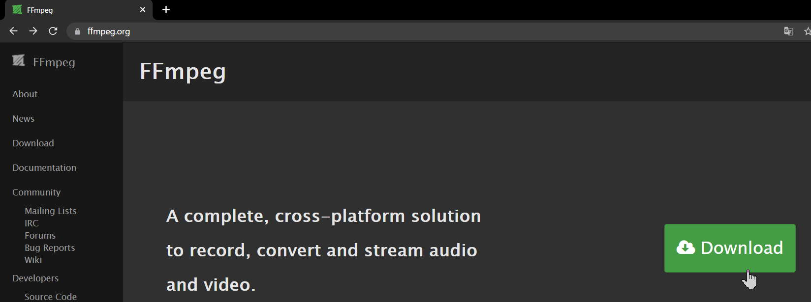

In the destination, select and download the latest (at the top) ffmpeg-0000-win64-gpl-shared.zip.

Placing Folders
Extract the downloaded file.
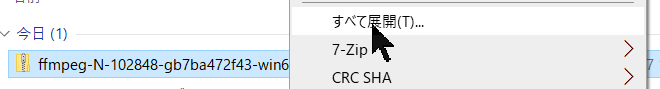
This may vary from case to case depending on your PC environment, but usually you will find a folder with the same name in the folder.

For the contents folder, change the name to ffmpeg because it is too long.


Cut out that ffmpeg folder and move it to directly under the C drive.

If it looks like this, it is OK.

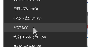
Setting the path
Lastly, the path setting, there seems to be a rather easy way to do this using Windows PowerShell, but I've read that it's not very reliable, so I'm going to use the straightforward method. I will explain it as carefully as possible.
Right-click on the Windows button at the bottom left of the screen and select System.
Click Advanced System Settings on the right side of the screen

Click on Environment Variables

Click Path.

Click "New"

Type C:\fmpeg\bin

Press OK when you're sure you've done everything correctly.

Press OK again.

That's it!
*If you are worried, you can start an application called Command Prompt, type ffmpeg, and press Enter. If you see the information about FFmpeg, you are good to go.
Script and description
Script
The script is as follows. It's so short, isn't it?
   Sub mp4output()


              ChDir "C:\MovingGraph_workingfolder"


              Dim command As String

              command = "ffmpeg -r 9.1 -i Transition_%05d.png  -vcodec libx264 -pix_fmt yuv420p -crf 16 -t 10 -progress log.txt movie_graph.mp4"


              Dim WSH2 As Object

              Set WSH2 = CreateObject("Wscript.Shell")

              WSH2.Run ("%ComSpec% /c " & command)

              Set WSH2 = Nothing


              End Sub
When registering the above script, the following settings must be done.
In the VBA screen, go to Tools → Reference Settings

Then, check the "Windows Script Host Object Model" checkbox and press OK.

If you save this file as a file with macros, it will remain checked the next time you use it.
Description
I'm having trouble finding direct information on how to link FFmpeg and Excel macros. With some research in Japanese and some in English, I managed to write the above script. However, I don't understand it very well.
ChDir "C:\MovingGraph_workingfolder"
-> Here, simply changing the current directory to C:\MovingGraph_workingfolder
Dim command As String
command = "ffmpeg -r 9.1 -i Transition_%05d.png -vcodec libx264 -pix_fmt yuv420p -crf 16 -t 10 -progress log.txt movie_graph.mp4"
-> define the string "command" and put the command to call ffmpeg at the "command prompt" there
- -r 9.1 -> 9.1 frames per second
- -i Transition_%05d.png → The input is a png image with "Transition_" and a sequential five-digit number.
- -vcodec libx264 → video codec is libx264
- -pix_fmt yuv420p → color space? is yuv420p.
- -crf 16 → quality is 16 (low quality (51) to high quality (0), where 0 is lossless)
- -t 10 → Set the video duration (in seconds) to 10 seconds.
- -progress log.txt → Keep a log of the results (progress) in a file named "log.txt".
- movie_graph.mp4 → The name of the output movie should be "movie_graph.mp4".
According to the specifications, if the pixel size of the original image is an odd number, it cannot be converted to video. For example, a 301x240 image will not work. You need to adjust the pixel size to be an even number, such as 300x240 or 302x240. I hope to make this more convenient in the future.。
Dim WSH2 As Object
Set WSH2 = CreateObject("Wscript.Shell")
WSH2.Run ("%ComSpec% /c " & command)
Set WSH2 = Nothing
-> I honestly don't know what it is. It's faster and more accurate if you Google it than if I explain it. I think it's like an Excel macro spell that calls the command prompt. The third line executes the command to ffmpeg that you put in the command, and the last line releases the role.
Actually, this was the part I had the most trouble with this time. I heard that there are two ways to invoke the command prompt, .Run and .exec. At first, I used the .exec method.
However, when the number of frames increased, or the number of seconds increased, or the resolution increased, FFmpeg instantly stopped working. Why is that? I don't know. Even though I have enough memory...
After a lot of struggling, I switched to ".Run" and it worked. It was hard for me to switch... Hmmm....
I don't know why it doesn't work with ".exec" at all. Someone please write an article about it... Anyway, I got stuck here, and it took me a lot of time and energy. By the way, the name "WSH2" is a remnant of the failure I had with WSH and .exec. I kept it as a souvenir.
Closing words
If you did all of the above and everything went well, you should have a video file in a folder called C:\MovingGraph_workingfolder.
In this case, 91 frames are used to create a 10-second movie at 9.1 frames/second. It would be more convenient if this could be set automatically in the cell (for example, if you specify the number of seconds, the frame speed is automatically set, or if you set the frame speed, the number of seconds is automatically set, etc.) instead of specifying it in the script. I would like to implement this feature when the final version is completed.
That's it for now, the sequence of events is complete.
In the next article, I would like to introduce a more convenient version that integrates these features.

https://magtanate.blogspot.com/2021/09/Lang-English-easy-motion-graph-file.html
DIY360
